
2015-06-03 »
Oh, now I get it. I thought I was learning R, but actually I'm learning statistics. That must be why none of the help screens make any sense.
2015-06-08 »
Net neutrality, no comcast merger, and now this? One would almost think the FCC is trying to make TV-over-Internet a thing.
http://www.tvnewscheck.com/article/85924/death-of-retrans-by-a-thousand-cuts
2015-06-10 »
In which Attic wins, even though it corrupts his data. But it does it fast! Bup was the only one out of the three that both finished and didn't corrupt anything. But it took more than twice as long. Lame.
http://librelist.com/browser/attic/2015/3/31/comparison-of-attic-vs-bup-vs-obnam/
(Thanks to Will Angley for the link.)
2015-06-19 »
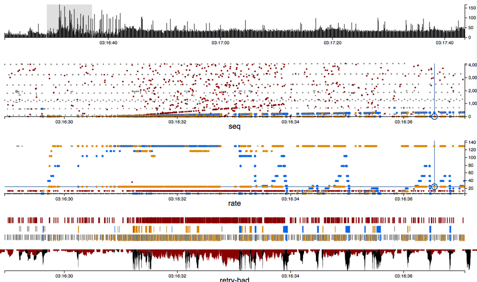
I love plots that say a lot. This one says a lot. (It's a sample of Zan's latest changes to wavedroplet, the wifi pcap analyzer.)
-
Top chart is the zoomed-out packet density overview. You can quickly find areas of interesting activity in a long term capture. The highlighted portion is what the rest of the charts are zoomed in on.
-
Second plot is sequence numbers. Red is bad packet checksums; blue is downstream to the selected station ("blue is like water which goes downstream"). Orange is upstream. Grey is other packets which are neither bad nor part of the selected session.
-
Third plot is PHY rates. You can see blue is having a pretty bad time.
-
Fourth section (three horizontal strip charts) highlights bad packets, retried packets, and good packets, respectively. This makes it easy to see periods of high retry activity (which, you'll note, correspond to the rate control nosedives for blue).
-
The final chart is a density plot of retries and bad packets, turned upside down because Evil. This one might evolve; maybe we'll merge it into the top plot instead.
(The actual data set here is from a hostapd bug a few months ago where it would fail to do key exchange correctly in the presence of heavy noise. You can see some telltale signs of PID rate control here; I think it was the mwifiex driver I was testing at the time, though everything using our hostapd was affected.)
2015-06-21 »
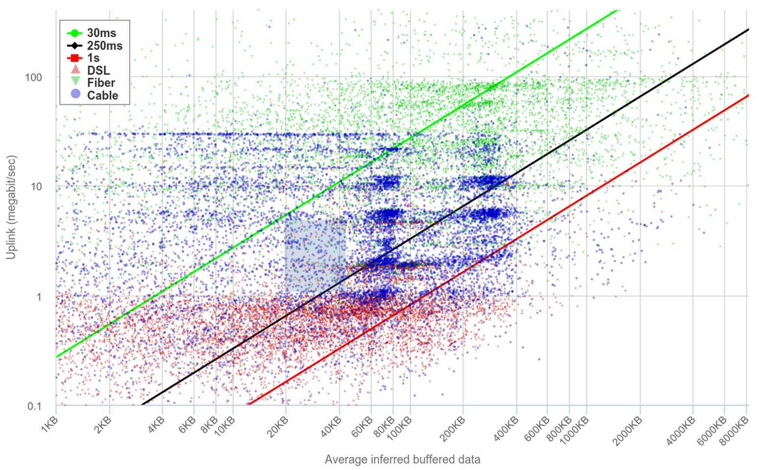
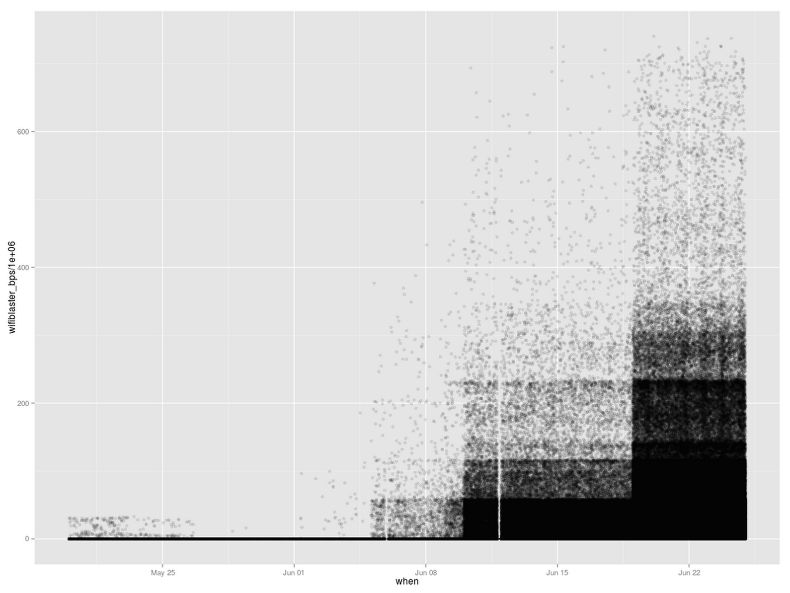
Pretty cool chart from the bufferbloat people, showing estimated buffer sizes for people on various different link types and speeds. The x axis is estimated buffer size, and y axis is speedtest results. Noise is (according to at least one person) attributed to wifi variability, but the darker clusters seem to pretty clearly converge.
The diagonal lines correspond to total latency if the buffer is filled up and your bandwidth is below a certain amount. So for example, the space between the black and red lines corresponds to between 250ms-1000ms of latency. Quite a lot of samples are in that range :(
http://www.dslreports.com/speedtest/results/bufferbloat?up=1
I'm really enjoying scatterplots lately.
2015-06-23 »
How many things can make me sad in a single error message?
autoreconf: Possible unintended interpolation of @2 in string at /jenkins/workspace/master@2/out.gfrg200/host/usr/bin/aclocal line 60.
2015-06-24 »
"Everybody loves collecting data. Nobody loves analyzing data."
– Zan Armstrong
I'm slowly concluding that this is for the same reason people love coding, but nobody loves testing. Because testing is when you find all the bugs.
2015-06-27 »
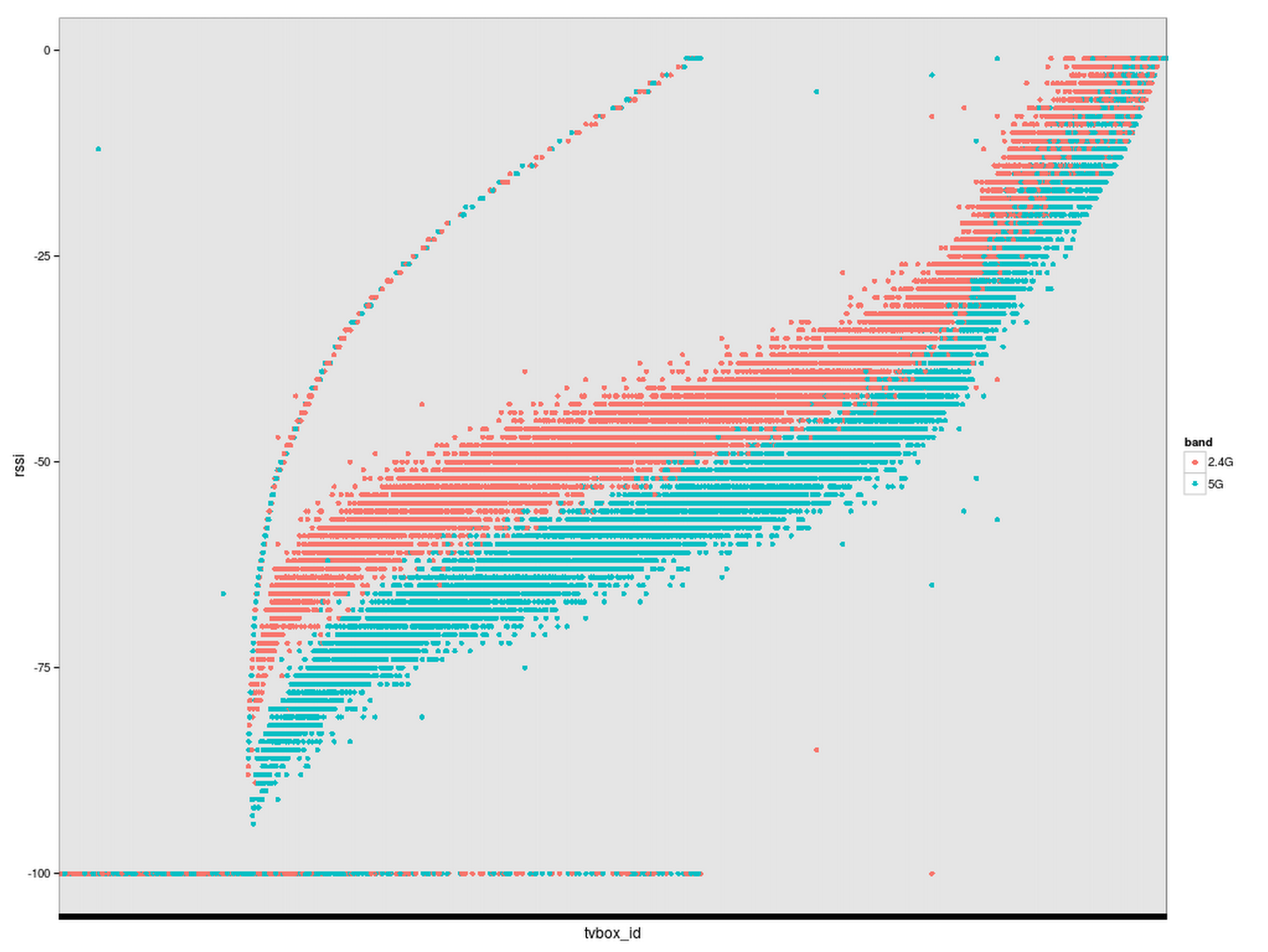
I think I've seen this plot at MOMA or somewhere. It's kinda industrial revolution style.
(It's also not useful. Looking at it, you might think speeds are increasing over time; in fact, it's just the number of samples that is increasing over time, which shows the progressively-less-common higher wifi speed bands more and more, while the more-common lower speed bands get completely saturated with samples. On the other hand, this gives a clue about how the modern art version of this painting was created: spraypaint and stencils, with progressively longer exposure times in different sections.)
This chart shows over 500,000 individual Gattaca test samples.
2015-06-28 »
In a discussion today, I realized another reason I like NAT and am not fond of IPv6: your ISP is now back to being all in-your-face about how you administer your network. They have to give you a route to more than one IP address, and a router that will help subdivide that subnet route to secondary routers on more subnets if you have them. If they choose not to do that, you're screwed.
Now that I'm thinking of it, I remember those days from IPv4. It sucked. I hate asking for permission from people who will identify me as a "power user" and charge extra to do what I want.
2015-06-29 »
Yay, Canada! Just think how fast you'll be able to hit your 20 GB/month cap now!
http://www.huffingtonpost.ca/2015/06/26/bell-gigabit-internet-toronto_n_7670728.html

Why would you follow me on twitter? Use RSS.