
2015-06-19 »
I love plots that say a lot. This one says a lot. (It's a sample of Zan's latest changes to wavedroplet, the wifi pcap analyzer.)
-
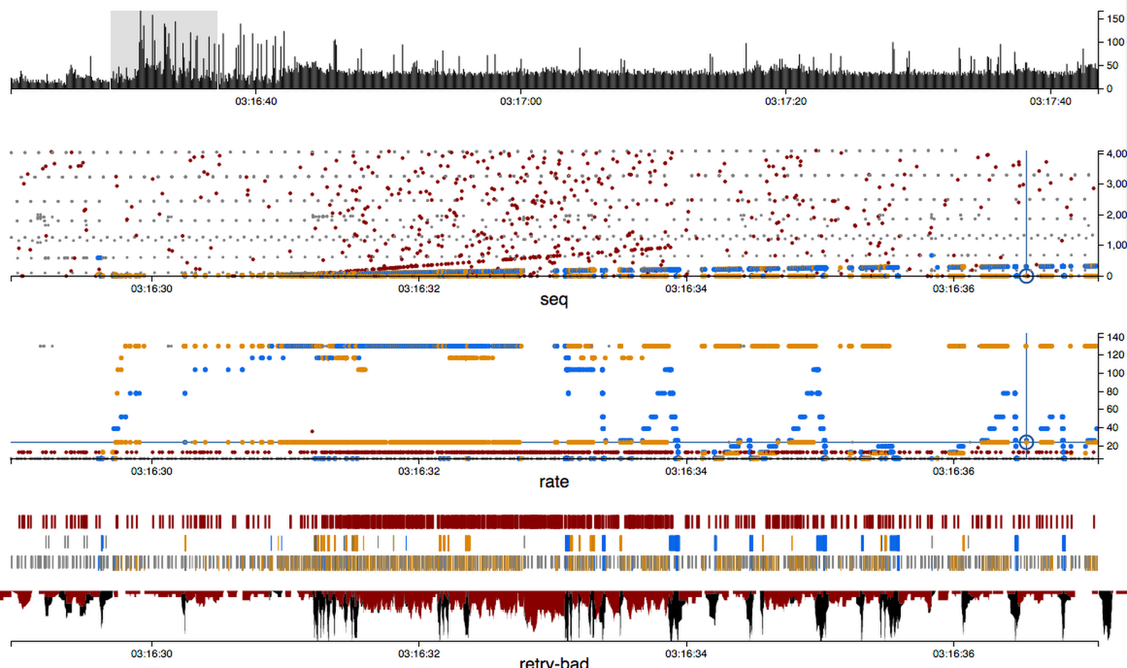
Top chart is the zoomed-out packet density overview. You can quickly find areas of interesting activity in a long term capture. The highlighted portion is what the rest of the charts are zoomed in on.
-
Second plot is sequence numbers. Red is bad packet checksums; blue is downstream to the selected station ("blue is like water which goes downstream"). Orange is upstream. Grey is other packets which are neither bad nor part of the selected session.
-
Third plot is PHY rates. You can see blue is having a pretty bad time.
-
Fourth section (three horizontal strip charts) highlights bad packets, retried packets, and good packets, respectively. This makes it easy to see periods of high retry activity (which, you'll note, correspond to the rate control nosedives for blue).
-
The final chart is a density plot of retries and bad packets, turned upside down because Evil. This one might evolve; maybe we'll merge it into the top plot instead.
(The actual data set here is from a hostapd bug a few months ago where it would fail to do key exchange correctly in the presence of heavy noise. You can see some telltale signs of PID rate control here; I think it was the mwifiex driver I was testing at the time, though everything using our hostapd was affected.)
Why would you follow me on twitter? Use RSS.