
Everything here is my opinion. I do not speak for your employer.
2015-06-27 »
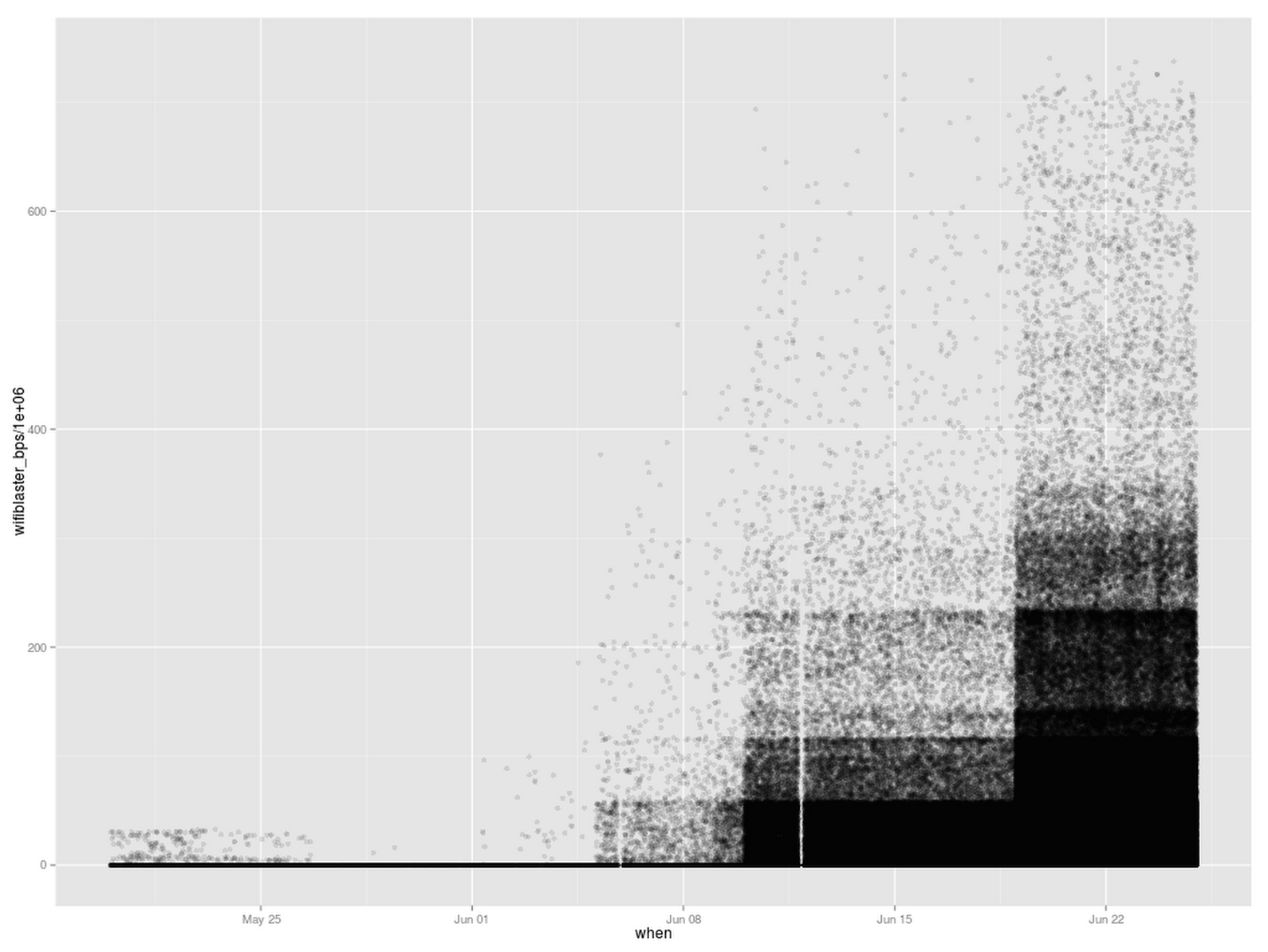
I think I've seen this plot at MOMA or somewhere. It's kinda industrial revolution style.
(It's also not useful. Looking at it, you might think speeds are increasing over time; in fact, it's just the number of samples that is increasing over time, which shows the progressively-less-common higher wifi speed bands more and more, while the more-common lower speed bands get completely saturated with samples. On the other hand, this gives a clue about how the modern art version of this painting was created: spraypaint and stencils, with progressively longer exposure times in different sections.)
This chart shows over 500,000 individual Gattaca test samples.
I'm CEO at Tailscale, where
AI runs on us, not the other way around.
Why would you follow me on twitter? Use RSS.
apenwarr on gmail.com