
2014-05-22 »
Visualizing network traces:
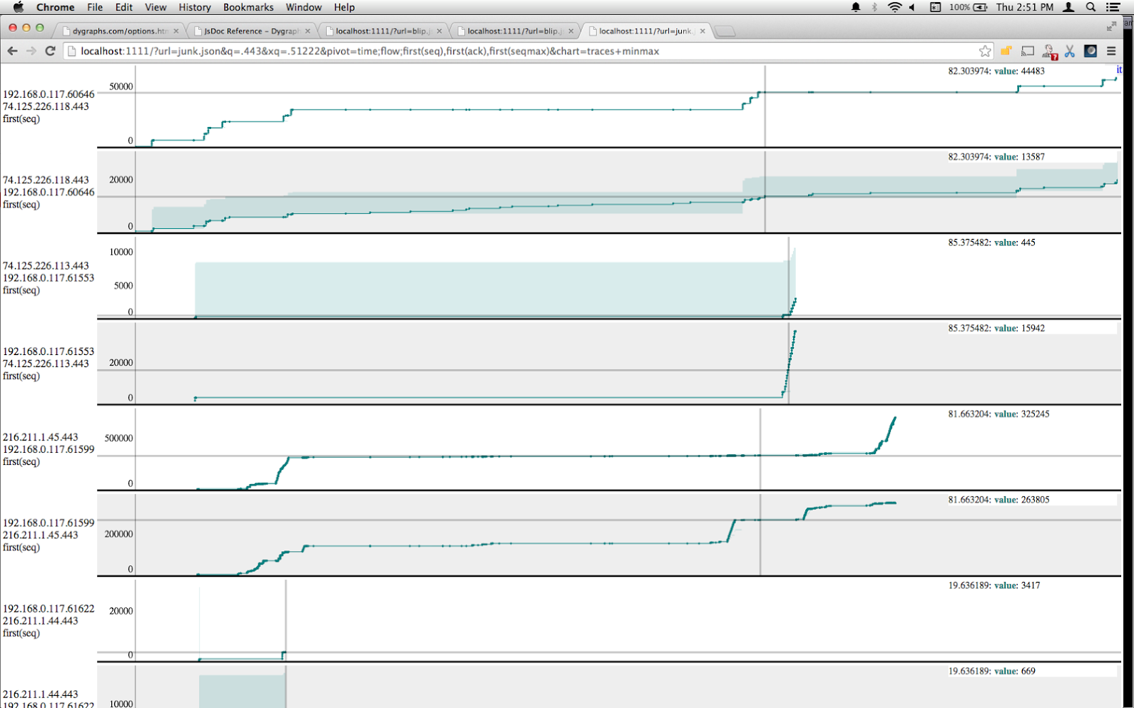
I'm trying to get some code going that will allow you to easily obtain and upload a network or wifi capture, and then let people like me visualize and analyze it (and hopefully someday, analyze it automatically). I'm a few steps away from that, but here's an early example. This is a TCP trace, so it doesn't have any of the wifi bits in it yet. It uses afterquery and dygraphs.
This combines the basics (possibly still buggy, oops :)) of a visualization method by Tim Shepard, which is simply to plot the cumulative bytes transferred (ie. current sequence number) of a TCP session on the Y axis, against time on the X axis. On top of that, we have a shaded area where the bottom is the bytes ACKed by the other end, and the top is that amount plus the rwin size, showing how much of the window the transmitter is currently using and how much it has left.
With that, I combined a view inspired by digital logic analyzers, with a bunch of narrow strip charts all sharing the same X axis (but totally different Y axes), stacked vertically. With a large number of traces, this is easier to view than plotting them all on the same chart. So where Tim could plot a single TCP session at a time, this tries to show you them all at once and how they compare over time.
I think the results are pretty neat, albeit not super useful yet. Tim's original visualization can point out things like TCP retransmits, duplicate ACKs, and SACKs, which are key to analysis. Also, just a few minutes of sniffing a network connection gets you a ton of tiny little useless TCP connections in addition to the interesting ones, causing a profusion of uninteresting graphs that blot out the interesting ones. On the other hand, I think this technique will be pretty good when visualizing wifi traffic, since I can plot eg. wifi sequence numbers on one chart, RSSI on the next, MCS on the next, retry count on the next, and so on. I just need to write more code to dissect wifi headers.
Using afterquery and dygraphs for this may have turned out to be a mistake. This sample plot is only 60 seconds worth of a very slow (3 Mbit/sec) Internet link, and the system is already kind of bogging down. Ironically it's not the number of packets, though, it's mostly just the HTML renderer sitting around laying things out, according to Chrome's profiler. That doesn't really make sense since it's just a bunch of rectangular fixed-size canvases. But throwing all this away and plotting directly onto a single canvas would probably go a lot faster.
Why would you follow me on twitter? Use RSS.