
2007-10-26 »
(This is part of a series about the UI design issues in the free Versabanq AmSchedule Express. This is not an advertisement, because if you're reading this, you have no use for my program. But download it yourself if you want to follow along. Absolutely no registration or signup is required.)
AMSE Part 5: Popup hints, online help, and the long-lost art of the status bar
One thing that business software seldom does is put effort into being discoverable - easy for new users to learn.
Mostly, business developers count on the fact that people have paid a lot of money and thus have the emotional investment required to slog through a long learning curve.
But we're giving away AMSE, and there are about a million other programs on the Internet that purport to do similar work. We're going to have to raise the bar here if we want to get and keep anyone's attention.
I'm the first to admit that online help and popup hints (tooltips) should be used only as a second line of defense when you're doing usability; if your program isn't easy to use just by looking at it, you're already halfway dead. But we're talking about banking software here. Some things just plain need some explanation.
AMSE offers three layers of helpfulness:
- Popup hints. Hover your mouse over just about anything, and you'll get a popup message saying what it does.
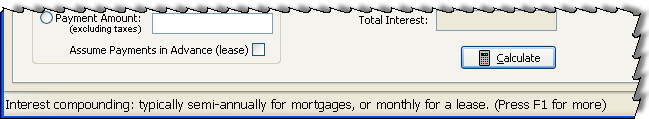
- Status bar hints. Move your keyboard input focus, and the status bar will change to the popup hint for that control... even if you don't use the mouse.
- Context-sensitive online help. Press F1 on any screen and you'll get help with all the options on that screen. We used the crazy but highly functional (and free) Vizacc HelpMaker 7 to build our help pages.
Surprises from user testing
I put AMSE through some unusually heavy (but still informal) hallway usability testing, and learned some interesting things about the discoverability of help systems. (The latest AMSE supposedly compensates for these lessons :))
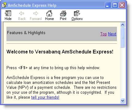
- Users, when confused, don't know where to begin. They don't start mousing around for popup hints. They certainly don't go looking in the Help menu. Usually they just push the first pushbutton they see, and hope it works. Sometimes they just panic and feel stupid. You have to lead them along somehow. In AMSE, we do this by popping up the online help automatically the first time they run the program, to remind them that it's there. We also make sure there's only one pushbutton on the main screen, and give a context-specific hint dialog if they press it too soon, in the hopes that they will actually read the dialog.
- Users don't know what the help program looks like, so if it pops up automatically, they assume *that's* your application. Nowadays the Windows help program looks kind of like a web browser, and web browsers commonly contain applications, so when the application window opens and a help window pops up on top, people aren't surprised that it might be your app. We dealt with this in two ways: first, by putting a message right in the help introduction that says "Press F1 at any time to bring up this help window" - suggesting that it's a help window, not the application. And secondly, by introducing a 1.5-second delay before popping up the help, so people have time to see the app appear before the help overlaps it. That extra 1.5 seconds makes a difference to usability.
- Power users hate the auto-popping help. Initially, the rule was to pop up the online help whenever the program is started but isn't yet installed. No good. People found the helpfulness too obnoxious after the first time. It turns out that we made running without installing so easy that some people don't install it at all.
- Nobody knows about pressing F1 for help anymore. I blame this largely on the facts that (a) the key doesn't even work in many apps, and (b) most online help is worthless or nonexistent. Our help is neither worthless (I hope) nor nonexistent, but people assume that it's bad like everyone else's. To get past this, the auto-popup feature is useful. Also, we append "Press F1 for more" to several of our popup hints (and thus status bar messages). I would have thought this was too "in your face", but adding the "Press F1 for more" hint made the difference between people looking in the help or just giving up.
- People don't notice popup hints. Some people who tested AMSE saw a couple of popup hints show up when they moved their mouse around. They didn't read the hints, just wiggled the mouse until the hints went away. Then they proceeded to not know what the various options were for - which the hint would have told them! The hints are valuable once you realize they're there, but some people just tune them out entirely. I think this might be because, like online help, popup hints are frequently worthless. I've seen an awful lot of "Open" toolbar buttons that just say "Open" as the tooltip. Gee, thanks.
- People notice status bar messages slightly more than popup hints. One reason AMSE has a status bar is that in tests, people noticed it faster than tooltips. I had to bump up the font size first, though; I almost resorted to having a light on it that would blink whenever the message changed (ie. whenever the input focus moved) to remind you that the message was important to you, but I thought that might be too obnoxious for power users. I think people notice status bar messages better because (a) they don't arbitrarily disappear, thus you have time to notice them; and (b) they don't overlap the thing you're working on, so they're not a nuisance you learn to tune out. Most importantly, I think that once people get a bit confused, they survey the whole window looking for things that might be helpful; popup hints aren't visible, so they don't help. Pushbuttons are a popular default target. But interestingly, a large number of people, doing their initial survey, pick up and read the line of text in the status bar. When that line of text is a plain sentence saying what to do right now, and it ends in "Press F1 for more," it means they don't need to panic anymore.
Status bars are funny: they were really popular (to do exactly what AMSE's does: one-liner help messages) for years - even in DOS. But they suddenly disappeared(1) around the time popup hints were invented. I guess developers figured there was no point being redundant, and popup hints were the newfangled and thus presumably better thing.
But popup hints are much worse in many ways. You can't passively see if they exist; you have to hover the mouse for a moment to make them appear. There's a delay before they appear, resulting in slower (thus more annoying) UI response. They disappear after only a couple seconds, making it hard to read the message. Developers don't write them very carefully, because developers don't see them either. And they annoyingly cover up the exact thing you're working on, by virtue of popping up near your mouse, which is always exactly where you're working.
Compared to that, status bars are a lot better. But people love their popup hints, so what the heck - let's give them those too. Who cares about redundancy? Apparently nowadays, people have such low expectations of online help that if you're going to provide it, you're going to have to shove it in their faces.
Next time: the viral bits. That's right, Web 2.0 weenies, native programs can do it too!
Footnotes
(1) ...or were lobotomized so their most prominent feature was a CAPS LOCK indicator. Good grief. I have one of those already!
Why would you follow me on twitter? Use RSS.