
2007-10-18 »
(This is part of a series about the UI design issues in the free Versabanq AmSchedule Express. This is not an advertisement, because if you're reading this, you have no use for my program. But download it yourself if you want to follow along. Absolutely no registration or signup is required.)
AMSE Part 3: The (lack of) menu bar
You might have noticed last time from the screenshot that AMSE has no menu bar - just a toolbar:
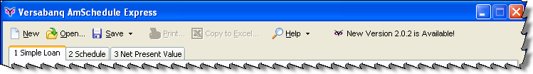
This is absolutely on purpose. The Web 2.0 people are absolutely right about some things, although it's often mostly by accident. In this case, I'm talking about menu bars. Web applications almost never have menu bars. Why? Well, originally, because they were annoying to do on the web. So people don't expect menu bars in web apps. So we still don't really use them, even though Javascript/CSS make them possible now. And so on.
In Windows applications, menu bars are still the standard. You might have heard that IE7 and Office 2007, however, replace the concept with "ribbons" - fancy context-sensitive toolbars. I've heard good and bad things about ribbons. In Office 2007, it's an especially tricky question because it's an existing program that everyone knows how to use already - even if it was bad before, changing it will make it worse for everyone for quite some time, so it's a huge bet.
But in a new application, menu bars are fundamentally bad and you should stay away from them. Take another hint from those web people.
Why are menu bars bad?
- Fitts' Law. Menu bars are thin and (in Windows/Linux) not at the top of the screen, so they're hard to aim your mouse at.
- Agility. When you click a menu, it drops down and you have to move your mouse very carefully straight down to your item, not veering to the left or right, lest you accidentally close or or switch menus. Yuck. Even if you're young and agile, it's still slow and annoying compared to just clicking a button. And don't even talk to me about sub-sub-menus.
- Discoverability. Programmers like to explore new programs and look in all the nooks and crannies to find interesting features; normal people don't. Even exploring dropdown menus is scary and tedious for a normal person, and if you ask them to do something, they often won't think of looking in the menu bar for it - believe it or not.
- Forced simplicity. When you have a menu bar, it's really easy to add new options to it. After all, there's a lot of stuff there already - what's wrong with adding one more? It's not like that makes it any more crowded... right? Wrong. Every option you add makes your program harder to discover and learn. If you let yourself use drop-down menus - and worse, sub-sub-menus - you're doing it because you're lazy. For most programmers, eliminating the menu bar will force you to trim out arbitrary complexity, thus improving your user interface. (That's another thing we can learn from the web - the forced simplicity has resulted in huge usability benefits.)
But what do we use instead of a menu bar?
Microsoft introduced the ActionBar around the time of Windows XP / Office XP. An ActionBar is an improved toolbar that's the predecessor to the ribbons in Office 2007. ActionBars are delightful to use, and the libraries that produce them work fine in earlier Windows versions as well.
Tips for using toolbars:
- Use labels, not *just* icons. Icon-only toolbars are, thank goodness, finally on their way out after years of horrible abuse. Icons are only useful by themselves when they're universal - the Power, Play, Pause, Rewind, Eject, Open, Save, and Print buttons are in this category. After a while, your brain becomes hardwired to read the Eject icon as if it were the word Eject. But icons that represent features iconically? Forget it. You have to examine the tiny picture, try to guess what it means, and then try to guess if that's what you wanted. Or more likely, you'll hover your mouse over each icon, one by one, and pray there's a popup hint. Both options are much slower than a menu bar, which was already bad! Do your users a favour: if you have any non-universal icons, label them. As a bonus, the added size from the label makes them an easier target for aiming the mouse (Fitts' Law again). Oh, did you notice that the best web applications also use words, not icons, for choosing operations? (Web design restrictions mostly forced this onto us for layout and page load time reasons, but it turns out to be another usability benefit.)
- Don't give too many choices. Just like dropdown menus are the lazy programmer's way out of simplifying their UI, so are toolbars. Why decide which options should be on the toolbar if you can just put all of them on toolbars? Well, because each extra toolbar button makes it harder for the user to skim for the one they need. It also makes it easier to hit the wrong one by accident. Here again, adding labels to your icons has a secondary effect: leaving you less space on the toolbar. That forces you to cut the number of options. It also avoids the lonely feeling you get when your icon-only toolbar looks empty with only the five buttons people actually use. (I strongly suspect that a lot of the world's overcrowded toolbars are caused by programmers' emotional response to this "loneliness" effect.)
- But do *use* icons. Icons make the toolbar more visually appealing and - much more importantly - easier to skim than just labels. Labels are for understanding, icons are for skimming. Incidentally, menu bars fail this point too because the menu bar itself doesn't have icons (and even if you add them, the icons look weirdly out of place there). Note: in a dropdown menu, usually some selections have icons and others don't; this is important, because skimming is impossible when there are 27 subtly-different icons anyway. So only the most important operations get icons. But here's an idea: why not just delete the options that aren't important? That's what we do on a toolbar.
- Don't make your icons "consistent." Brains are optimized to easily detect differences in colour, shape, and size - use those differences to make it easy to scan for the icon you want. The actual picture on the icon is actually not very skimmable. When in doubt, make the icon visually appealing and distinct, rather than relevant. (But don't distinguish icons based solely on colour. Remember, some people are colour blind.)
- Don't make toolbars draggable. Believe it or not, normal people don't actually care whether their toolbar is at the top of the window, or the bottom, or the side. Furthermore, if you let them drag their toolbars around, they'll do it by accident and not know how to get it back how it was. As a bonus, if you drop the configurability, your application will always look the same for everyone, so if someone borrows another person's workstation, they won't be confused.
- Don't make toolbars optional or customizable. If your toolbar is designed properly, it already has exactly the set of buttons on it that people need; that means they don't need to add and remove buttons. And take a hint from Office 2007's ribbons: if you have lots and lots of options, display just the ones that are actually relevant in the current context, not all of them; that means users should never have to manually toggle particular toolbars on and off. All put together, that means you can also eliminate the commands for customizing and toggling the toolbars, which is good because you don't have dropdown menus anymore and you can't afford to waste precious toolbar space for such trivial things.
- Use intelligent defaults. The difference between "Save" and "Save As" has always annoyed me. Sometimes Save is greyed out, but Save As is available... but that means Ctrl+S, the universal hotkey for saving a file, doesn't always work. What should happen is that Ctrl+S (or File|Save, for that matter) should ask for a filename if it doesn't have one, and use the current filename otherwise. Save As (usually Shift+Ctrl+S) should always ask, but is much more rarely needed than Save. In AMSE, I handled this by creating a "Save" button that is actually Save As if there's no filename, and Save otherwise, but is always CTRL-S. If you click the dropdown arrow, you get the rarer (but still sometimes needed) Save As option. Next time: how to crash more elegantly.
Why would you follow me on twitter? Use RSS.