
2007-10-03 »
A note on bank runs
It so happens that I was at a banking conference in Montreal this week and I saw a presentation by Guy St-Pierre, the current president of Canadian Deposit Insurance Corporation (CDIC).
I learned several things. Here are some interesting ones.
First, apparently only 10% of Canadians can correctly name the maximum amount that their savings deposits are guaranteed in case of a bank failure: it's $100,000. (I was one of the 90%. The previous evening I had been discussing it with sfllaw and thought it was $40,000. He said he thought it might be $60,000, which was actually correct until they increased it again a couple years ago.) On the other hand, 75% of Canadians know that their deposits are insured.
Second, credit unions use a totally different (but equally valid) insurance provider than banks. Each province has its own. Several provinces have limits greater than $100,000. Some have unlimited deposit insurance. And the insurance applies to the home province of the credit union, not the home province of the depositor! So if you have more than $100,000 in cash that you want to guarantee, you might want to look into a credit union in one of those provinces. (I sure wish I had that problem :))
Third, about those bank runs. There was a highly publicized run on Northern Rock bank in England a few weeks ago. My question at the time was: why bother running to the bank if it's in trouble? Since deposits are insured anyway, even if they crash and can't give me my money, somebody else will. Isn't the whole point of deposit insurance to eliminate bank runs?
Well, yes, in fact, that's true... but not in England! There, they use a system called coinsurance, that is, "spreading risk among multiple parties." In this case, that's you and the government. In a fit of brilliance, only 90% of your deposits beyond about $4000 is covered by the deposit insurance in England. So if there's a run on the bank, and you're not first in line, you'll lose 10% of your savings account. Which gives you a perverse incentive to continue a run on the bank; and the worse the bank run gets, the more incentive you have. Oops!
I don't know what the point of the 90% limit was supposed to be; as we've now learned in retrospect, it undermines the main point of deposit insurance, which is that you shouldn't have to ever use it.
In Canada (and the U.S. too, I think), we have 100% insurance up to $100,000. So if there's a run on your bank, feel free to sit at home and watch it on TV.
2007-10-04 »
X11 on MacOS X
Some time ago pcolijn wrote that he'd given up on my suggestion that to get things done on MacOS, you should use a virtual Linux machine in Parallels.
I meant to reply to his post at the time, but I didn't. I've also had to look up the answers to some of these problems a few too many times, so here it is for my reference, and maybe the rest of the world's, in case they care.
Parallels Linux slow display, laggy mouse, cut and paste problems
Virtualizing a Linux display and raw input devices in Parallels is horribly slow. Let's face it, Parallels is for running Windows. They just don't care about Linux that much.
The way to deal with this is simply not to do it; hide your Parallels window entirely (Cmd-H) and just use the MacOS X11.App to display your Linux session. This solves pcolijn's problems of copy-and-paste, slow mouse cursors, and inflexible key remapping (see xmodmap).
Parallels bridged networking causes X11 problems
Unfortunately using X11.App increases problems with Parallels' "bridged" networking mode. As you move your laptop around, the IP address of your X server keeps changing, which means that anything connected to it stops working. Sigh.
Solution: use "host-only" networking instead. Then go to System Preferences | Sharing | Internet. Share your connection from "Airport" or "Ethernet", whichever you're connected to. Check all the checkboxes. Click Start.
This way, MacOS will allow outgoing connections from your Parallels session, masquerading them through a single IP.
Do not attempt to use Parallels' "shared" network mode, which is supposed to do the same thing, but is subtly different. The problem with that mode is it allocates an IP subnet for its sharing automatically every time you start Parallels; if you use more than one VM, things hop around and you can't hard-code your IP address, which makes it hard to ssh from MacOS into your VM, and hard to set your DISPLAY variable in Linux.
Linux can't accept incoming connections with Parallels Host-only networking
Computers outside your Mac can't connect to your Linux system this way. You might consider this an advantage, ie. you don't need to set up a firewall in every virtual machine. But sometimes you want other machines to connect in... and you still want the non-IP-hopping advantage of the host-only networking mode.
Solution: create a second virtual network interface in Parallels, and use bridged mode there. Connect to X11 with the host-only network, but connect into the system using the bridged network.
MacOS X11's default window manager is stupid
The quartz-wm window manager that comes with X11.app is pretty, but annoying: most annoying is that no matter how many apps you open, you only see one big "X11" app icon on the happy bar, and it keeps getting confused about focus, and you (argh!!) can't switch between X11 windows easily using the keyboard.
Solution: use a real window manager hosted in your Linux system. I like ion2, which lets me do almost everything with the keyboard. To do this, create a .xinitrc in your Mac home directory with just these lines:
   #!/bin/bash
   . ~/.profile
   exec ssh -Y my-linux-machines-ip ./.xsession-macos
Then create a .xsession-macos that does what you want, including starting the window manager.
Keybindings in MacOS X11 are stupid
Here's the xmodmap file I use with ion2.
clear mod1
clear mod2
add mod1 = Meta_L
add mod2 = Meta_R
keycode 78 = plus
keycode 74 = asterisk
keycode 85 = slash
keycode 80 = equal
keycode 63 = Meta_L
keycode 66 = Meta_R
keycode 84 = Control_R KP_Enter</pre>
Load it from your .xsession-macos file. There's some kind of weird bug in
the MacOS X11.App that means you need to do this twice, that is:
xmodmap .mymodmap
xmodmap .mymodmap
Otherwise nothing will happen.
gnome-settings-daemon and window managers can't start from Linux when displaying on MacOS
If you connect using "ssh -X my-linux-system", you might get an error like
one of these (hi, Google!):
>> Unable to redirect root window events for screen 0.
>> Refusing to start due to encountered errors.
The application 'gnome-settings-daemon' lost its connection to the
display localhost:10.0; most likely the X server was shut down or
you killed/destroyed the application.
The application 'metacity' lost its connection to the display
localhost:10.0; most likely the X server was shut down or you
killed/destroyed the application.
Window manager warning: Screen 0 on display "localhost:10.0"
already has a window manager</pre>
Solution: use "ssh -Y" instead of "ssh -X" (see the .xinitrc file contents
above). Otherwise certain X11 features don't work. Argh. Stupid security
people. In earlier ssh releases, "-X" did all the things the new "-Y"
option does, but not anymore. This is supposedly for security reasons, but
I find it hard to believe that someone with access to create X windows of
any sort wouldn't be able to trick me one way or another.
2007-10-05 »
More on bank runs
- The best I (or anyone) can do is make it so that if it sucks for me,
it's at least because it sucks for everybody else too.
-- dcoombs
2007-10-06 »
Pmarca on Versabanq
Okay, not really. But he does have a great quote that I think is relevant:
- The exception comes when an industry has gotten so old and
ossified that the clear opportunity exists to up-end it and introduce a new
order, a new way of doing things, and therefore a new set of companies.
In some industries this happens routinely -- e.g. every 10-20 years. This is the case in technology, for example, and financial services.
-- Pmarca
2007-10-07 »
Setting up MS SQL 2007 Express for access via TCP
pmccurdy has been doing some work with us lately, and got to have some "experiences" with Microsoft SQL 2005 Express Edition. Here's a variation on his guide for how you set it up for the first time so that you can access it from a Linux machine over TCP. Blame me for any errors, since I edited it.
- Install as normal. Believe that life may yet be worth living.
- Ignore the Surface Area configuration thingy. As far as I can tell, its only trick is occasionally crashing. It sure does a bang-up job of reducing your surface area for successful connections from Linux though.
- Run the SQL Server Configuration Manager.
- Select "SQL Server 2005 Network Configuration", then "Protocols for SQLEXPRESS" (or your selected instance name).
- Enable TCP/IP.
- Right click TCP/IP, pick Properties.
- Click the "IP Addresses" tab.
- Under the "IPAll" pseudo-section, delete the entry for "TCP Dynamic Ports" and set "TCP Port" to 1433 (deleting the dynamic port entry may not be needed, but makes it more obvious what's going on if you try to connect with Microsoft's client).
- Click OK, acknowledge the dialog box.
- Go to SQL Server 2005 Services, and restart the SQL Server service.
- Drown your sorrows.
2007-10-10 »
AMSE Part 1: Everything I know about software installation in 0.5 seconds or less
Recently my new company released a free Windows application (it also runs under WINE) called AmSchedule Express (AMSE). It does some basic banking calculations that readers of my journal probably don't care about. However, the program does a lot of neat non-banking-specific things that I'm really proud of.
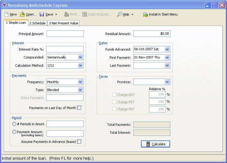
My all-time favourite feature of AMSE is its installation process. I've written before about setup/install programs, and I generally hate them. They're scary. They make you feel like installing and uninstalling programs is a complex operation not to be performed by mere mortals. And the fact is, that's mostly true. Except it shouldn't be.
AMSE takes all the advice I gave in my tips for writing Windows setup.exe installers. Since it's the first program I've ever seen that does all these things right, I think it's worth pointing out some of them in detail.
- All the files it needs are in a single .exe file, tied together using my KRAM library. You can't accidentally copy, install, or delete only part of the program.
- It uses the registry only to recall personal preferences, not critical (and often redundant) operational information. It finds its executable by looking at argv[0], like any good program should.
- It runs without being installed at all. You simply download the executable and run it, and it works.
- It knows how to install itself. A button on its toolbar says "Install
in Start Menu:
When you click it, it changes to "Installing..." Almost exactly 0.5s later, it changes to "Done!", and after another brief delay, disappears completely. During that process, it copies its (single) .exe file to your Program Files directory(1), sets up some registry keys for its *.am file association, and creates a Start Menu entry for itself.(2)

- The only reason the installer takes 0.5 seconds to install is that I put in a 0.5-second Sleep() (yes, it's capitalized and takes milliseconds, not seconds, in Win32) statment. Actually, the time it takes to install the program on a modern computer is small enough to be unobservable by humans. I needed the delay because if it's too fast, it's hard to believe anything has actually happened (or even read the "Installing..." message), and my test users thought it was broken.(3)
- A similar "Uninstall" option is available from the Help menu. Unlike installing, it asks for confirmation first. This is because installing the application is both nondestructive and desirable (for us); it makes the program a bit more "viral." But uninstalling is hard to undo, since you might have lost the original executable, so we'd better ask first.(4)
Even if you have no use for AMSE, the installer is just plain fun to try. Why not download it and see for yourself? And please email me if you have any comments about any aspect of the program; I'd love to hear about it.
Footnotes
(1) Actually, the Program Files directory is not writable if you're not an admin user. I sincerely hate setup programs that actually execute just fine as a normal user goshdarnit but then refuse to do their job because they're just so helpless, and they really can't make your program work unless you're an admin. AMSE just puts itself in your personal Local Settings folder if it can't write to Program Files.
(2) Incidentally, the Start Menu icon is added directly to Start->Programs, not to a subfolder. Why do people keep putting subfolders in there? For every app I install, there's always only one program I actually want to run. The other icons just make that one program even more annoying to find, and this is even worse because the folder always has the same stupid folder icon, while my application has an actual program icon that makes it easier to skim for. And no, I don't need a desktop icon for your stupid obnoxious app, and neither does anybody else, thanks for asking (and they all ask, too).
(3) This isn't the first time I've had to add an arbitrary delay to one of my installation programs for exactly this reason. Most installers just feel annoyingly slow (and I suspect it's just bad programming, not Sleep statements). But, perhaps because of that trend, an installer that takes zero time makes people uncomfortable. The best answer is a happy (if synthetic) medium.
(4) While initially writing the install/uninstall feature, I had the Uninstall button appear on the main menu bar (replacing the disappearing Install button) when the program detected that it was installed. I also didn't have a confirmation dialog. I did that only temporarily, because it made the testing easier. And man, the testing was fun. It just feels so great to push a button, get instant feedback, and in basically no time feel like you accomplished something. Click. "Is it installed? Hmm, let me check the start menu... yup!" Click. "Is it uninstalled? ... yup!" I must have done this for half an hour straight, with varying obstacles like in-use .exe files alrady in the destination directory, etc. I'm sorry to have denied you the experience - and non-sucky software installation is a rare experience indeed - but for usability reasons it was necessary to very slightly discourage the undesirable/destructive operation (uninstalling), so it had to go into a dropdown menu instead.
Next time: with self-installing comes... self-upgrading!
2007-10-11 »
This journal doesn't allow comments, so you won't easily be able to criticize me yourself here. Instead, for a counterpoint, I'm offering this alternative series of articles by a mysterious anti-Avery. (Note: I'm not crazy. You're crazy.)
AMSE Sucks Part 1: One of these installers is not like the others
AMSE's installation process is kind of neat, in an innovative, genius-induced, and totally nonstandard sort of way. But here's the thing. Windows users have come to expect that installers work a particular way. They complain when there's no installer. They don't know what to do if there isn't one. How do I get my program into the start menu? How do I know I won't lose it? And of course, they'll tend to delete the .exe file they downloaded, because of course that .exe file is just and installer and it isn't used for the actual program, right?
Sure, AMSE deals with most of this: as long as you click the install button in the main app. If you don't - and remember, there's no wizard forcing you to do it - users might not notice that option, and the first time they run it might be the last. Not because they don't like it, but because they never can find it again.
This isn't the only one of the well-known Windows software installation rules that AMSE breaks. There are lots more:
- It installs itself straight to Start->Programs, not Start->Programs->Subfolder, which means it only gets to have a single icon in the start menu. In other words, there's no link to the readme, the documentation, or the uninstaller. Maybe you've never clicked on any of those, but some people do, and they'll be ticked off that you've left them out. You want to tell me about bankers? Bankers are conservative and careful; try to give them a program, but hide the documentation, and they'll be turned off. Even if it's free. In fact, maybe especially if it's free.
- AMSE doesn't install an icon for itself on the desktop or in the system tray. What's with that? Some users just can't figure out the start menu, instead choosing to start all their applications straight from the desktop. That's because the start menu's "All Programs" section is crowded with junk, while the desktop has more room, so it doesn't seem as crowded. Also, they can move the icons around and remember where on the screen they left a particular icon, making it easier to track down later. Not so with the Start Menu. There's a reason every installer in the world plops itself on the desktop. Users have no trouble ignoring an excess icon, but most have no idea how to create one that isn't there.
- AMSE can install itself even if the system is locked down and a user isn't an administrator. Seriously, what are you writing here, a virus? There's a reason the sysadmin locked down these machines - to prevent people from installing stuff and messing up their computer! Bypassing their safeguards just makes security worse. Never mind the fact that you might end up with multiple copies of the program installed, since non-admin users can't install a program to share with other people. Your program will clutter up my machines, and I, the sysadmin, am the one who's going to have to deal with it.
- You put all the supporting files in a single .exe, rather than installing them all separately. Why? There's a reason filesystems were invented; it's so that every single application doesn't have to write its own fake one. It doesn't matter that Windows opens, creates, and copies files slowly; users hardly ever do that. The advantage of a big directory filled with non-executable files far outweigh the disadvantages. What if I wanted to make a hyperlink to your online help (*.chm) file on my desktop? I can with any other program, but I can't with AMSE, because it doesn't even exist.
- And why is the install/uninstall process so fast? I mean it. You're making other people's programs, especially InstallShield, look bad by comparison. Long, slow software installation processes are critical on all sorts of levels. First of all, they make the computer seem scary and incomprehensible to normal users, which increases my value to the users. Installers also give consultants an easy source of stress-free billable hours: someone has got to babysit this completion bar, right? What if it asks a question all of a sudden? Exactly. If you ruin the whole perception that software installation is complicated and slow, you ruin my business. (Trivia: this is a complaint we frequently heard about Nitix too when I worked there.)
- I'm sure there is a reason your installer is so fast; you're probably forgetting to test compatibility with different OS versions, hardware configurations, and user/network settings. That's the value InstallShield brings. You should be fired for risking your company by writing an installer from scratch. Even if some of the things you did do turn out to be good, one mistake and you've blown all of it instantly.
2007-10-14 »
(This is part of a series about the UI design issues in the free Versabanq AmSchedule Express. This is not an advertisement, because if you're reading this, you have no use for my program. But download it yourself if you want to follow along. Absolutely no registration or signup is required.)
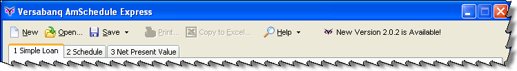
AMSE Part 2: Self-upgrading software
AmSchedule Express can check automatically whether a new version is available. If it is, a new button appears on the toolbar:

The great thing about writing programs that are all contained in a single .exe file and can install themselves rather than requiring a separate setup program is that the logical next step - making it download and upgrade to new versions automatically - is almost trivially easy. The process looks like this:
- Download the new .exe file into the user's temp directory.
- Show a toolbar button with a label like, "Try the new version."
- If/when the user clicks the button, execute the new .exe file (wherever it may be lying around) and exit the old one.
- The new .exe file runs as if it isn't currently installed - which it isn't.
- If you don't like it, exit it. Windows will clean up your temp directory eventually. Your old version is still installed.
- If you do like it, click the same install button you used to install it the first time. It'll overwrite the old version - of course, since we know all versions, new and old, consist of a single .exe file.
It was joyfully easy to write this code, although I've done it before. Long, long ago, around 1993, I wrote a Windows 3.1 program ("FoxCon," the Foxnet Communications Inc. console) that did something similar for an ISP. Then, when we made the first versions of Nitix, I did pretty much the same thing, except since Nitix is a whole operating system it's much more complicated to code up and test (it involves rebooting). The same tricks apply, though: combine all the little files into a single blob (in Nitix's case, actually three blobs, but whatever), try running the new version without installing it permanently, and if the new version works, only then will you even be able to click the Install button and switch away from your old version.
Sometimes I wish this stuff weren't so obvious, so I could patent it. Apparently nobody would license my patent anyway, though, since patent or not, nobody does it but me. Sigh.
Next time: death to menu bars! How AMSE's toolbar is optimized for usability.
2007-10-15 »
(I'm not crazy. You're crazy.)
AMSE Sucks Part 2: I like my current version just fine, thanks
AMSE has a feature that lets it upgrade itself. Lots of programs do that, so okay. But the way AMSE does it is just weird.
First of all, where's the option to adjust how frequently it checks for updates? What if I only want to check every week, or every month? I see that it doesn't pop up a nauseating and intrusive dialog immediately when it sees that a new version is available - that's refreshing - but what if I don't want to waste the bandwidth of checking all the time?
When an update is available, all that happens is a button appears on the toolbar. Okay, I guess, but what if I don't notice? And how do I make it go away and stop bothering me if I don't care about the new version? I can't.
Then I click the button, and what happens? No completion bar, no dialog box, no wizard. The button just says "Downloading..." for an indeterminate amount of time. Gee, thanks. Okay, on my connection it was only about 15 seconds, but I have a pretty fast link. Won't people with slow links be confused? Meanwhile the program keeps running and I can go on with my work, but I can't do two things at once even if the computer can; I'm too excited about my download to calculate a mortgage schedule right now. Plus, if I accidentally exit the program while it's downloading - or even after it's done downloading - then I have to start all over again next time. Great. It's a nice way for you to inflate your web hits, but not much else.
Once the download finishes, it offers to let me try the new version. Okay, great. But the new version looks exactly like the old version. How do I even know it's really the new one? And how do I install it? And why did the old one just quit out from under me? Okay, I see that the "Install" button has appeared on the menu, so I guess that'll install the new version - but don't I have to uninstall the old one first? That's what I have to do with every other program, so you're just freaking me out now. And if I exit this new one by accident, where does it go? Do I have to download it again in order to install it? This is all totally unlike my normal experience in Windows. It makes me nervous. I don't like it.
At the very least, download the file automatically before you even tell me the new one is available - and keep it around, so that you don't download it again next time. Plus, there's no impatient waiting while I download the new version, because it would silently happen in the background before I knew it. That one change alone would make the experience a lot more pleasant.(1)
Footnotes
(1) Good idea, anti-me. Actually I thought of that already but I haven't had time to implement it, and upgrading is an infrequent enough thing that I haven't gotten around to that yet. There's also a question of whether we should be downloading large files without asking the user first. Although I guess Windows and Java do it, so why not?
2007-10-16 »
StartupCampWaterloo is next week
StartupCamp Waterloo is next Tuesday, October 23, evening. I'm planning to be there. The agenda looks a bit up in the air at the moment, but sometimes that's the best kind.
If you're in the Waterloo, Ontario area, you should come too!
2007-10-18 »
(This is part of a series about the UI design issues in the free Versabanq AmSchedule Express. This is not an advertisement, because if you're reading this, you have no use for my program. But download it yourself if you want to follow along. Absolutely no registration or signup is required.)
AMSE Part 3: The (lack of) menu bar
You might have noticed last time from the screenshot that AMSE has no menu bar - just a toolbar:
This is absolutely on purpose. The Web 2.0 people are absolutely right about some things, although it's often mostly by accident. In this case, I'm talking about menu bars. Web applications almost never have menu bars. Why? Well, originally, because they were annoying to do on the web. So people don't expect menu bars in web apps. So we still don't really use them, even though Javascript/CSS make them possible now. And so on.
In Windows applications, menu bars are still the standard. You might have heard that IE7 and Office 2007, however, replace the concept with "ribbons" - fancy context-sensitive toolbars. I've heard good and bad things about ribbons. In Office 2007, it's an especially tricky question because it's an existing program that everyone knows how to use already - even if it was bad before, changing it will make it worse for everyone for quite some time, so it's a huge bet.
But in a new application, menu bars are fundamentally bad and you should stay away from them. Take another hint from those web people.
Why are menu bars bad?
- Fitts' Law. Menu bars are thin and (in Windows/Linux) not at the top of the screen, so they're hard to aim your mouse at.
- Agility. When you click a menu, it drops down and you have to move your mouse very carefully straight down to your item, not veering to the left or right, lest you accidentally close or or switch menus. Yuck. Even if you're young and agile, it's still slow and annoying compared to just clicking a button. And don't even talk to me about sub-sub-menus.
- Discoverability. Programmers like to explore new programs and look in all the nooks and crannies to find interesting features; normal people don't. Even exploring dropdown menus is scary and tedious for a normal person, and if you ask them to do something, they often won't think of looking in the menu bar for it - believe it or not.
- Forced simplicity. When you have a menu bar, it's really easy to add new options to it. After all, there's a lot of stuff there already - what's wrong with adding one more? It's not like that makes it any more crowded... right? Wrong. Every option you add makes your program harder to discover and learn. If you let yourself use drop-down menus - and worse, sub-sub-menus - you're doing it because you're lazy. For most programmers, eliminating the menu bar will force you to trim out arbitrary complexity, thus improving your user interface. (That's another thing we can learn from the web - the forced simplicity has resulted in huge usability benefits.)
But what do we use instead of a menu bar?
Microsoft introduced the ActionBar around the time of Windows XP / Office XP. An ActionBar is an improved toolbar that's the predecessor to the ribbons in Office 2007. ActionBars are delightful to use, and the libraries that produce them work fine in earlier Windows versions as well.
Tips for using toolbars:
- Use labels, not *just* icons. Icon-only toolbars are, thank goodness, finally on their way out after years of horrible abuse. Icons are only useful by themselves when they're universal - the Power, Play, Pause, Rewind, Eject, Open, Save, and Print buttons are in this category. After a while, your brain becomes hardwired to read the Eject icon as if it were the word Eject. But icons that represent features iconically? Forget it. You have to examine the tiny picture, try to guess what it means, and then try to guess if that's what you wanted. Or more likely, you'll hover your mouse over each icon, one by one, and pray there's a popup hint. Both options are much slower than a menu bar, which was already bad! Do your users a favour: if you have any non-universal icons, label them. As a bonus, the added size from the label makes them an easier target for aiming the mouse (Fitts' Law again). Oh, did you notice that the best web applications also use words, not icons, for choosing operations? (Web design restrictions mostly forced this onto us for layout and page load time reasons, but it turns out to be another usability benefit.)
- Don't give too many choices. Just like dropdown menus are the lazy programmer's way out of simplifying their UI, so are toolbars. Why decide which options should be on the toolbar if you can just put all of them on toolbars? Well, because each extra toolbar button makes it harder for the user to skim for the one they need. It also makes it easier to hit the wrong one by accident. Here again, adding labels to your icons has a secondary effect: leaving you less space on the toolbar. That forces you to cut the number of options. It also avoids the lonely feeling you get when your icon-only toolbar looks empty with only the five buttons people actually use. (I strongly suspect that a lot of the world's overcrowded toolbars are caused by programmers' emotional response to this "loneliness" effect.)
- But do *use* icons. Icons make the toolbar more visually appealing and - much more importantly - easier to skim than just labels. Labels are for understanding, icons are for skimming. Incidentally, menu bars fail this point too because the menu bar itself doesn't have icons (and even if you add them, the icons look weirdly out of place there). Note: in a dropdown menu, usually some selections have icons and others don't; this is important, because skimming is impossible when there are 27 subtly-different icons anyway. So only the most important operations get icons. But here's an idea: why not just delete the options that aren't important? That's what we do on a toolbar.
- Don't make your icons "consistent." Brains are optimized to easily detect differences in colour, shape, and size - use those differences to make it easy to scan for the icon you want. The actual picture on the icon is actually not very skimmable. When in doubt, make the icon visually appealing and distinct, rather than relevant. (But don't distinguish icons based solely on colour. Remember, some people are colour blind.)
- Don't make toolbars draggable. Believe it or not, normal people don't actually care whether their toolbar is at the top of the window, or the bottom, or the side. Furthermore, if you let them drag their toolbars around, they'll do it by accident and not know how to get it back how it was. As a bonus, if you drop the configurability, your application will always look the same for everyone, so if someone borrows another person's workstation, they won't be confused.
- Don't make toolbars optional or customizable. If your toolbar is designed properly, it already has exactly the set of buttons on it that people need; that means they don't need to add and remove buttons. And take a hint from Office 2007's ribbons: if you have lots and lots of options, display just the ones that are actually relevant in the current context, not all of them; that means users should never have to manually toggle particular toolbars on and off. All put together, that means you can also eliminate the commands for customizing and toggling the toolbars, which is good because you don't have dropdown menus anymore and you can't afford to waste precious toolbar space for such trivial things.
- Use intelligent defaults. The difference between "Save" and "Save As" has always annoyed me. Sometimes Save is greyed out, but Save As is available... but that means Ctrl+S, the universal hotkey for saving a file, doesn't always work. What should happen is that Ctrl+S (or File|Save, for that matter) should ask for a filename if it doesn't have one, and use the current filename otherwise. Save As (usually Shift+Ctrl+S) should always ask, but is much more rarely needed than Save. In AMSE, I handled this by creating a "Save" button that is actually Save As if there's no filename, and Save otherwise, but is always CTRL-S. If you click the dropdown arrow, you get the rarer (but still sometimes needed) Save As option. Next time: how to crash more elegantly.
2007-10-19 »
(I'm not crazy. You're crazy.)
AMSE Sucks Part 3: I like menu bars, loser!
You just wrote an absurdly long article about something you didn't put in your program. Does that bother you? Do you have any sense of priorities at all?
Menu bars have been around since the first mouse-driven program was driven by the first mouse. And there's a reason for that: they work.
Everybody knows there's a hierarchy of learning for software users. First they click on the things that are easily visible on the screen, like toolbars. If they can't find it there, they look through the menus. And if they find a menu option they use frequently, they learn its hotkey and start using that.
Menus are useful for all kinds of options that are sometimes important but often not needed, like option toggles. Where would you put the option for toggling the status bar and toolbars on and off if not on the menu? Oh sure, you claim that those options aren't important enough so you left them out. Well, I've got news for you, power users like me like those options and we use them all the time. Removing features doesn't improve your program, it makes it less useful. A program with 80% of the features won't be used by 80% of people, it'll be used by nobody. And leaving out your menu bar makes falling into that trap all too easy.
And leaving out menus leads you to also misuse toolbars. I notice that the "Help" option is a dropdown menu - why not a button? And if it's a dropdown, then why not in a menu bar? Why is "Recommend to a friend..." in the Help menu? Just because you were embarrassed to have too many menus, because it would defeat your point? Oh, that's really mature.
I don't like your giant menu buttons, either. They waste valuable screen real estate. That's the real value of menu bars and traditional icon-only toolbars; they pack more power into less space! I see your thing about Fitt's Law and requiring less mouse agility, but okay, fine; give me a toggle to choose which mode I want. I'm agile enough to hit a pushbutton of any reasonable size. Yeesh.
And I can't believe you don't even let me move the toolbar around. For heaven's sake, the feature is built into Windows now! It's not like you need to actually code anything. In fact, I feel like you turned off this ability just to annoy me. On a widescreen monitor, it only makes sense to put my toolbars on the side, because I've got more horizontal space than vertical, and it's easier to read documents when they're narrow anyway.
Your top-only toolbar makes using your program actually painful for me. My head hurts. Goodbye.
2007-10-20 »
Re: enterprise software's "youth drain"
Here's an interesting article discussing how very few young people are getting into enterprise software nowadays. It enumerates several good reasons why this might be, and a few comparatively lame reasons why people should look into it anyhow.
I just want to add one more interesting point: baby boomers are starting to retire. What today looks like a software market locked up by highly successful old people could be greatly changed in a few years as those old people start to leave in large numbers.
(As always, what I write here are my own personal opinions, do not necessarily represent my employer, etc.)
2007-10-21 »
This would be a good time to visit Montreal
I recently found out about Montreal Blitzweekend, a 48-hour programming/etc challenge on November 24 and 25, 2007. macournoyer from Standoutjobs has an interesting post urging you not to participate.
I personally love this sort of thing. As I said about last November's NaNoWriMo: Impossible deadlines and absolutely no quality standards? Hello, count me in! (Incidentally, I'm doing NaNoWriMo again this year too.)
Which all reminds me of the RapidPrototypingContests (RPCs) that we used to do at NITI. These were challenges where we'd break into teams to see who could build the best prototype of the given requirements in a single weekend. Mostly I was the one who wrote the rules, and I mostly ended up judging the results. So perhaps the best thing about Blitzweekend compared to an RPC is that I can participate and I won't have to hold myself back when I do :)
A note on naming: Blitzweekend vs. RPC
There are two points in the name "Rapid Prototyping Contest" that do not come out in "Blitz Weekend," giving us a hint that it's targeted a bit differently. The points are:
- Prototyping. "Blitz" implies producing something useful in a short time. Prototyping implies *trying out* ideas in a short time. Trust me, you will not produce a valuable product in 48 hours. That's by definition: if it can be done in 48 hours, it can be done by your competitors in 48 hours, so it's not valuable. At best, you might produce something that *looks* to other people like it might be a valuable product. But you, the developer, have to see it for what it is. Most people are very bad at letting go and admitting they're working on a prototype. And almost everyone is bad at throwing away their prototype and starting over from scratch to build the real thing.
- Contest. I have no idea of whether BlitzWeekend will be competitive - ie. with rules and judges - or not. I suspect not. In fact, the most fun RPCs we had were also not very competitive, and it saves time on judging, so that works for me.
2007-10-22 »
(This is part of a series about the UI design issues in the free Versabanq AmSchedule Express. This is not an advertisement, because if you're reading this, you have no use for my program. But download it yourself if you want to follow along. Absolutely no registration or signup is required.)
AMSE Part 4: Reporting crashes back to the developer
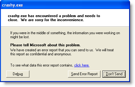 |
During the development of AMSE, I distributed a few early versions to various people (including my sister) around the Internet. Predictably, they did some things I wasn't expecting, and the program crashed or gave weird errors.
Weird errors are a problem for three reasons:
- People don't read error dialogs, but it still gives them an unsettled feeling (= less user enjoyment);
- Even if people notice the error, they never quote it back to you accurately (if at all);
- Even if they quote it back to you accurately, the error message itself isn't usually that helpful because programmers are idiots (including me, apparently). This is particularly true in case your program segfaults.
Some of my testers (hi, Jana) were especially helpful and successfully bypassed the first two problems, but even the most helpful tester will be confounded by #3. One error message I got, "12/29/2029 is not a valid date," is pretty unhelpful for several reasons: first, I didn't write that error message; it doesn't show up in my program code anywhere. And second, 12/29/2029 is a valid date! A stack trace would have been nice.
Of course, developers have long ago figured out what to do about this problem. Most "serious" apps nowadays include a "quality feedback agent" that catches problems and offers to report them back to the vendor to have them fixed. Ah, yes. Quality feedback agents. QFAs.
Why quality feedback agents suck
- The user has no idea what's going on. Most QFAs ask a series of confusing questions like, "What were you doing when I died?" and "Can you give us reproducible steps to make the problem recur?" and "What do you think the priority of this bug should be?" and (the nerve!) "What component of our software do you think this bug is in?" Normal people don't know the answers to *most* of these questions, and even if they did, most users would answer them incompetently. Why bother asking at all?
- The user doesn't care enough to put in any effort. Again with the wizards: asking too many questions will discourage people from submitting the bug at all. As a developer, I'd rather be inundated with vague bug reports (that at least include stack traces) than miss most of my reports because people cancel the wizard; so why have a wizard at all? Some crash reporting systems actually make me *log in* to the bug tracking site before they can finish their submission; less awful ones still demand my email address; still others make it optional. Why even ask? The first thing *all* these systems ever say is a variant of, "We get way too many bug reports to actually go through them all. Nobody will contact you unless we need you for something." In other words, as a user, giving you my address has no upside and only a possible downside (you might bother me about it later).
- It's the 21st century, you can send data in the background. This is one of the most insulting things in most QFAs: after I've gone through the idiotic wizard and agreed in triplicate to submit the bug report, it pops up a modal progress dialog and refuses to do anything else until the upload is complete. Yow! First of all, how does it take an observable amount of time to submit a simple stack trace? Web browsers do HTTP POST requests instantly all the time - but QFAs seem to take at least 10 seconds to report bugs, sometimes much longer. I'm talking to you, Microsoft and Borland. And secondly, why can't I do anything else at the same time? Multitasking was invented some time ago now, guys; I think we should consider using it for stuff.
AMSE's bug reporter
AMSE's error reporting system barely even qualifies as a QFA; it has basically no user interface:
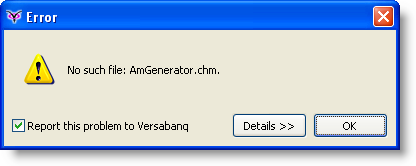 |
Whenever an unexpected error happens, we pop up an error dialog. (Delphi is kind enough to let you define a "default exception handler" at the top level, and null/invalid pointer references get turned into exceptions too - clever. Then we use the awesome JclDebug to get the Delphi stack trace.) The error dialog has a checkbox for "Report this problem to Versabanq." The default is on. If you toggle it on or off, we remember the setting globally for all Versabanq applications in the registry for all future errors.
When you click OK, if the checkbox is checked, we silently go off into the background and submit an HTTP POST with your error message and stack trace. Yes, it's anonymous, because yes, it's true, we really don't expect to have time to reply to every possible submission, so there's no point quizzing you about your address. There's no completion bar, because you, the user, don't care if the submission has started, finished, or failed; you have no emotional investment in it whatsoever, other than annoyance.
Best of all, because the user interface is so lightweight, you won't even think twice about leaving the checkbox checked (unless you're a developer or you have privacy concerns). That means every time you get the error, you'll probably submit it to us. GREAT! - that means we'll easily find out which problems are frequent problems for you (and others) and which are a one-time thing. The statistics about crash reports are extremely important.
Just like playing with the AMSE installer, I find reporting crashes with AMSE fun. It's actually enjoyable to push the OK button on the error dialog, knowing that the dialog will go away instantly and I can get on with my work, and I'm helping out (okay, in this case, I'm spamming myself, but you get the idea). Instant gratification is a powerful thing.
Next time: popup hints, online help, and the long-lost art of the status bar.
2007-10-23 »
(I'm not crazy. You're crazy.)
AMSE Sucks Part 4: All my crash reports are belong to you
Here you go reinventing the wheel again. You had to write your own installer; did you really have to write your own Quality Feedback Agent too? Do you know there are whole companies dedicated to doing this? Do you honestly think you can do better in your spare time? Well, I've got news for your ego: it's too big. Ouch! Oh yeah. Take that.
I have one major gripe with the way you report errors. It's the way you do it silently. In AMSE, the only way the user knows he's reporting things to Versabanq is if he leaves the checkbox checked. Everybody always leaves the checkbox checked, because nobody ever reads error dialogs, and you know it. That means people are unintentionally sending possibly private information to you when they have an error.
Sure, it might be legal, because you give them a checkbox (which nobody reads) to let them opt out. Sure, you probably protect their anonymity as part of the submission script and never store any personal information in a database. Sure, the information you send is probably carefully generated so it doesn't include any private data. Yeah, great. Do you think that'll matter when the feds finally come?
Plus, there are times when you shouldn't get feedback about errors. What if it was my fault? How are you going to fix your program if the error was caused by me doing something wrong? I suppose you're going to tell me that no matter what caused the problem, if your program didn't avoid it, then it's the developer's fault. Good grief. Don't try to be a hero, loser, it'll only lead to tragedy in the end.
There's one more big problem with this whole thing: an anonymous bug report is a bug report you can't reply to. Users are doing you a favour by sending you crash report information. Some of them don't care, but some of them are really interested in whether their bug gets fixed. How will you tell them when it is? If you don't ask for their email address, you can't send a reply. And furthermore, if they're not even willing to provide an email address, why do you care about their experience anyway? After all, they obviously don't care about you. Software development is a two-way street.
Sheesh, have you ever done software before? You're obviously a head-in-the-clouds idealist who is about to smack facefirst into the real world. When you finally do, maybe then you'll understand.
And I don't like all those stupid web applications that silently collect error logs in the background either. It's exactly the same kind of slimy privacy invasion.
2007-10-26 »
(This is part of a series about the UI design issues in the free Versabanq AmSchedule Express. This is not an advertisement, because if you're reading this, you have no use for my program. But download it yourself if you want to follow along. Absolutely no registration or signup is required.)
AMSE Part 5: Popup hints, online help, and the long-lost art of the status bar
One thing that business software seldom does is put effort into being discoverable - easy for new users to learn.
Mostly, business developers count on the fact that people have paid a lot of money and thus have the emotional investment required to slog through a long learning curve.
But we're giving away AMSE, and there are about a million other programs on the Internet that purport to do similar work. We're going to have to raise the bar here if we want to get and keep anyone's attention.
I'm the first to admit that online help and popup hints (tooltips) should be used only as a second line of defense when you're doing usability; if your program isn't easy to use just by looking at it, you're already halfway dead. But we're talking about banking software here. Some things just plain need some explanation.
AMSE offers three layers of helpfulness:
- Popup hints. Hover your mouse over just about anything, and you'll get a popup message saying what it does.
- Status bar hints. Move your keyboard input focus, and the status bar will change to the popup hint for that control... even if you don't use the mouse.
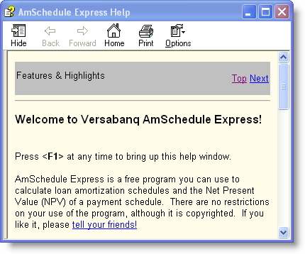
- Context-sensitive online help. Press F1 on any screen and you'll get help with all the options on that screen. We used the crazy but highly functional (and free) Vizacc HelpMaker 7 to build our help pages.
Surprises from user testing
I put AMSE through some unusually heavy (but still informal) hallway usability testing, and learned some interesting things about the discoverability of help systems. (The latest AMSE supposedly compensates for these lessons :))
- Users, when confused, don't know where to begin. They don't start mousing around for popup hints. They certainly don't go looking in the Help menu. Usually they just push the first pushbutton they see, and hope it works. Sometimes they just panic and feel stupid. You have to lead them along somehow. In AMSE, we do this by popping up the online help automatically the first time they run the program, to remind them that it's there. We also make sure there's only one pushbutton on the main screen, and give a context-specific hint dialog if they press it too soon, in the hopes that they will actually read the dialog.
- Users don't know what the help program looks like, so if it pops up automatically, they assume *that's* your application. Nowadays the Windows help program looks kind of like a web browser, and web browsers commonly contain applications, so when the application window opens and a help window pops up on top, people aren't surprised that it might be your app. We dealt with this in two ways: first, by putting a message right in the help introduction that says "Press F1 at any time to bring up this help window" - suggesting that it's a help window, not the application. And secondly, by introducing a 1.5-second delay before popping up the help, so people have time to see the app appear before the help overlaps it. That extra 1.5 seconds makes a difference to usability.
- Power users hate the auto-popping help. Initially, the rule was to pop up the online help whenever the program is started but isn't yet installed. No good. People found the helpfulness too obnoxious after the first time. It turns out that we made running without installing so easy that some people don't install it at all.
- Nobody knows about pressing F1 for help anymore. I blame this largely on the facts that (a) the key doesn't even work in many apps, and (b) most online help is worthless or nonexistent. Our help is neither worthless (I hope) nor nonexistent, but people assume that it's bad like everyone else's. To get past this, the auto-popup feature is useful. Also, we append "Press F1 for more" to several of our popup hints (and thus status bar messages). I would have thought this was too "in your face", but adding the "Press F1 for more" hint made the difference between people looking in the help or just giving up.
- People don't notice popup hints. Some people who tested AMSE saw a couple of popup hints show up when they moved their mouse around. They didn't read the hints, just wiggled the mouse until the hints went away. Then they proceeded to not know what the various options were for - which the hint would have told them! The hints are valuable once you realize they're there, but some people just tune them out entirely. I think this might be because, like online help, popup hints are frequently worthless. I've seen an awful lot of "Open" toolbar buttons that just say "Open" as the tooltip. Gee, thanks.
- People notice status bar messages slightly more than popup hints. One reason AMSE has a status bar is that in tests, people noticed it faster than tooltips. I had to bump up the font size first, though; I almost resorted to having a light on it that would blink whenever the message changed (ie. whenever the input focus moved) to remind you that the message was important to you, but I thought that might be too obnoxious for power users. I think people notice status bar messages better because (a) they don't arbitrarily disappear, thus you have time to notice them; and (b) they don't overlap the thing you're working on, so they're not a nuisance you learn to tune out. Most importantly, I think that once people get a bit confused, they survey the whole window looking for things that might be helpful; popup hints aren't visible, so they don't help. Pushbuttons are a popular default target. But interestingly, a large number of people, doing their initial survey, pick up and read the line of text in the status bar. When that line of text is a plain sentence saying what to do right now, and it ends in "Press F1 for more," it means they don't need to panic anymore.
Status bars are funny: they were really popular (to do exactly what AMSE's does: one-liner help messages) for years - even in DOS. But they suddenly disappeared(1) around the time popup hints were invented. I guess developers figured there was no point being redundant, and popup hints were the newfangled and thus presumably better thing.
But popup hints are much worse in many ways. You can't passively see if they exist; you have to hover the mouse for a moment to make them appear. There's a delay before they appear, resulting in slower (thus more annoying) UI response. They disappear after only a couple seconds, making it hard to read the message. Developers don't write them very carefully, because developers don't see them either. And they annoyingly cover up the exact thing you're working on, by virtue of popping up near your mouse, which is always exactly where you're working.
Compared to that, status bars are a lot better. But people love their popup hints, so what the heck - let's give them those too. Who cares about redundancy? Apparently nowadays, people have such low expectations of online help that if you're going to provide it, you're going to have to shove it in their faces.
Next time: the viral bits. That's right, Web 2.0 weenies, native programs can do it too!
Footnotes
(1) ...or were lobotomized so their most prominent feature was a CAPS LOCK indicator. Good grief. I have one of those already!
2007-10-27 »
(I'm not crazy. You're crazy.)
AMSE Sucks Part 5: Face it, nobody reads the documentation
That was a really great article about documentation in AMSE. I only have one problem with it: you've totally wasted your time.
Here's how the real world works. First, people load your program. Then, if they don't understand exactly how it will help them get laid within the first 5 seconds, they close the program and go do something else.
You know how much online help you can read in 5 seconds? None. You know how many tooltips? None. You know how many statusbar messages? None.
Your program is, by definition, too complicated for the average person to understand. It does math. QED.
There's only one way complicated programs can spread, and that's by making them expensive and hiring expensive trainers to walk the lusers through it one step at a time. People don't read, but they'll listen if they're paying a consultant $200/hour to explain the process to them using one-syllable words, four-colour brochures, and extravagant hand gestures.
And that's why your whole endeavour is completely doomed. You can't give something like this away for free, because consultants don't work for free, and people don't pay $200/hour consulting fees for programs they downloaded for free off the Internet. It makes them feel like idiots.
Isn't that ironic? All that online help you wrote to try to make users feel smart, and your users still feel like idiots because they got it for free. They'd be much happier if you sold them the program for $1000/seat and made it interminably hard to use. At least then they'd feel like they accomplished something.
I'm afraid there's only one idiot in this picture. Idiot.
2007-10-30 »
(This is part of a series about the UI design issues in the free Versabanq AmSchedule Express. This is not an advertisement, because if you're reading this, you have no use for my program. But download it yourself if you want to follow along. Absolutely no registration or signup is required.)
AMSE Part 6: Desktop applications can be viral too!

There are an awful lot of people starting useless Web 2.0 companies nowadays. Web 2.0 is not inherently useless, of course, just overhyped. What makes it overhyped? Well, the idea that you have to do your application on the web in order to benefit from its concepts, and that therefore native software applications are doomed.
Who knows, maybe most native software is doomed. But I prefer to hedge my bets, and one of my bets is that banking software will be some of the last to go. Is Google going to host all your private financial transactions? For every bank? For banks in Switzerland? I doubt it.
But just because we're not doomed doesn't mean we can't learn from people who do it better than we do. Some of the previous articles in this series have pointed out some web-based innovations that apply easily back to native software. But the trickiest one is the key to the whole Web 2.0 movement: viral adoption.
That is, getting people to tell their friends about your stuff so that they'll use it too, leading to exponential growth.
Barriers to viral adoption
- If people don't like your stuff, they won't tell their friends.
- If people have to pay for your program, adoption is cut dramatically.
- If your software isn't compatible with people's computers or operating systems, they won't try it.
- If people can't figure out how to install your software, they won't try it at all.
- If people think they have to install your software, they'll be too scared to even try.
- If people aren't admins on their own machines (like people at a locked-down office with a domain controller), they can't install software.
- If people understand how to install your software but think they'll get a virus, they'll be scared.
- If people don't have an easy way to tell their friends about your software, they don't bother.
Moving your app to the web solves pretty much all these problems... except for that tedious little problem #1. The problem is, it's hard to write a good web application that's useful and painless to use. It's actually much easier to write native applications that are painless; the fact that so few people do is an essay for another day. But curiously, lots and lots of mostly stupid Web 2.0 applications do quite well at the viral part, flunking only problem #1.
Viral adoption in AMSE
Respectively:
- AMSE has a likeable UI, using a lot of time-tested UI innovations (including ones stolen from the web): as few buttons as possible, no menu bar, online help, a status bar, tooltips, keyboard navigation, instant response times, and critically for bankers: total privacy since you're not uploading your private data to an untrusted web site. Hopefully it's also useful.
- AMSE is free, so there's no disincentive to using it. We'll worry about the profits later. Now there's a Web 2.0 idea :)
- AMSE only runs on Windows. This is sort of a problem, except that all bankers run Windows. Just look at those Apple ads on TV. Know who that guy in the suit is? He's a banker.
- AMSE is easy to figure out; click on the .exe file and run it.
- AMSE works without installing but it can install itself if you like it.
- AMSE can install itself in your personal settings folder even if you're not an administrator on your PC.
- AMSE does look more like a virus than web apps usually do; this is pretty unavoidable. You can sort of help this situation by digitally signing your app, but it's of limited use. Luckily Windows makes it look like you'll get a virus no matter what you do, so people are desensitized to this. Also, AMSE is carefully designed not to set off any scary Vista OMG OMG THE SKY IS FALLING dialogs, even during installation.
- AMSE offers menu options for recommending to a friend, and desktop applications make this extra easy; it just calls up your favourite mail program to do it.
So, uh, will it spread?
That's something I can't answer with hallway usability testing. It depends if AMSE actually does something people in our target market actually want. I think it does. Initial experiments seem to say so. It also depends whether our target users talk to each other, are open to new technology, and are good enough friends to recommend a useful program to others. Only time will tell.
2007-10-31 »
(I'm not crazy. You're crazy.)
AMSE Sucks Part 6: So you want to be Web 2.0
Well, let's just say you weren't the first person to write an article about viral software adoption. You know what you have in common with all those other people? That's right, you suck too.
Viral adoption has one major defining attribute, which is that it almost never works. Except for the gigantic successes. But those are extremely rare among literally thousands of companies that think they can spend $0 on marketing and get their community to do all the work and then make money. Yeah, good luck with that.
Real life is different. If your program doesn't suck, then you can charge money for it. When people pay money for something, we say they have skin in the game. That means they'll feel like idiots if they can't get your program to work, no matter how stupid it is, because otherwise they'll be out 20 bucks. And the more money they spend, the more they'll recommend it to their friends, because if they do get it to work and it does turn out to be useless, then it's all the more important to suck as many people into the charade as possible. That way they won't criticize your stupid decision, because it would make them hypocrites. Instead, they'll throw good money after bad, desperately hoping that the next upgrade or $200/hour consultant session will make things finally work. Maybe it will, maybe it won't. Who cares? They're locked in, and you're rich.
Instead, you're giving stuff away. No lock in, no skin in the game, no hypocrisy, no profits. Great idea! I say get some of that eager VC financing, fast, before they catch on.
How come this year it's Facebook, but last year it was Friendster or Google or Myspace? How can multi-billion dollar businesses appear overnight? The answer is simple: they're fads. If they can appear overnight, they can die overnight, and trust me, some of them will. It'll probably happen about the time that people realize that "addictive" is not actually a valuable attribute in a respectable service.
What was I talking about again? Oh yeah, viral banking software. I can't believe I just wrote that. Kill me now.
Why would you follow me on twitter? Use RSS.