
2015-06-21 »
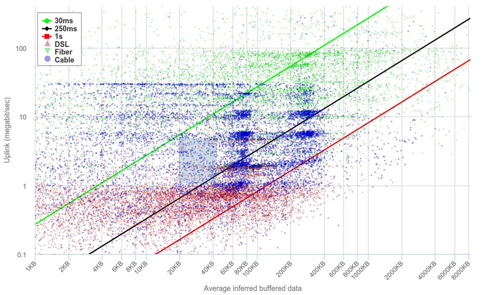
Pretty cool chart from the bufferbloat people, showing estimated buffer sizes for people on various different link types and speeds. The x axis is estimated buffer size, and y axis is speedtest results. Noise is (according to at least one person) attributed to wifi variability, but the darker clusters seem to pretty clearly converge.
The diagonal lines correspond to total latency if the buffer is filled up and your bandwidth is below a certain amount. So for example, the space between the black and red lines corresponds to between 250ms-1000ms of latency. Quite a lot of samples are in that range :(
http://www.dslreports.com/speedtest/results/bufferbloat?up=1
I'm really enjoying scatterplots lately.
You can find me on Bluesky. Or subscribe with RSS.