
2014-05-23 »
More network packet visualization, this time with wifi.
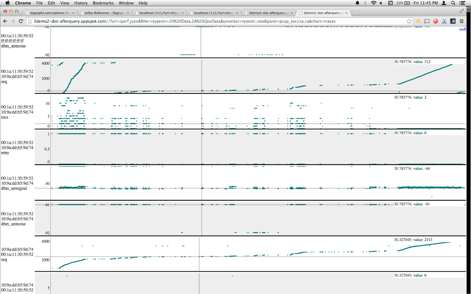
It's interesting to zoom in on the 'seq' (wifi packet sequence number) graph and compare it to the 'mcs' (modulation/coding scheme number, roughly corresponding to transmit rate) graph directly beneath it. You can see some packets get transmitted, then they get retransmitted (sequence numbers repeat), and it still didn't work so it backs off to a lower rate.
This is the TV box 1.0 doing the transmitting. I believe it has particularly bad rate selection, so I think this is an example of doing it "wrong", but I can't quite say that for sure because I'm only just now finally able to graph this stuff and I haven't seen a "good" transmitter yet.
In other news, RSSI was -65 or so even from about 8 feet away. The TV box is mounted behind a TV, but still... pretty sad signal strength.
You can find me on Bluesky. Or subscribe with RSS.